
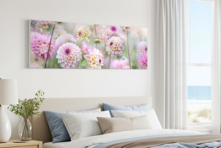
Most wall art follows familiar proportions. Portrait prints rise vertically, landscape prints sit within a conventional rectangle, and square artwork creates a contained focal point.
Panoramic prints behave differently.
Their extended width changes how the eye moves across an image. Instead of centring on a single subject, a panorama presents relationships between elements: shoreline and horizon, mountain range and valley, or a city skyline unfolding across the frame.
This makes the format particularly effective in interiors, where it aligns with the horizontal lines already present in sofas, sideboards, beds, dining tables and architectural features. Used well, a single panoramic print can occupy a wide wall without the need for multiple pieces.
A format shaped by the way rooms are built
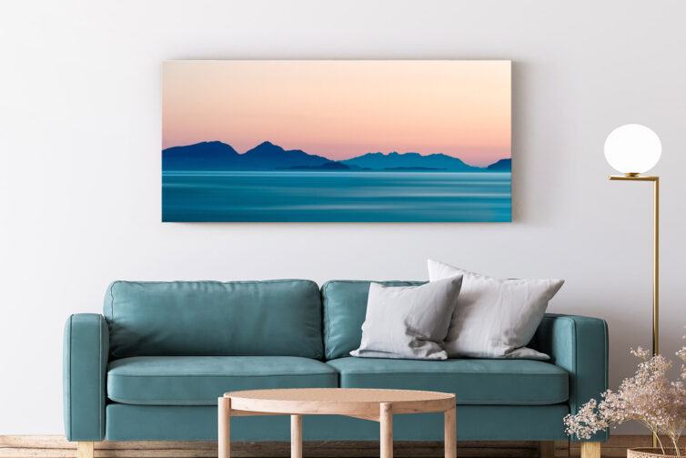
British homes rarely offer uninterrupted wall space. Chimney breasts, alcoves, windows, radiators and doorways naturally divide surfaces.
What remains is often wider than it is tall, especially above furniture such as sofas, beds and sideboards.
A standard landscape print can feel constrained in these spaces, while enlarging it may introduce unwanted height. A panoramic format resolves this by extending width without increasing vertical dominance.
Above furniture, proportion matters more than scale alone. The artwork should relate to the object beneath it, not float as an isolated rectangle. A wider image can follow the line of a sofa or headboard while still leaving enough wall space for balance.
The goal is not to fill every gap, but to create a clear relationship between image, furniture and wall.
Why some photographs need more width


Panoramic photography is most often associated with landscapes because many natural scenes are inherently horizontal.
A coastline is defined by the interaction of land, sea and horizon. A mountain range gains structure from its sequence of peaks. A cityscape is often read through repetition across its skyline.
Cropping these scenes into standard formats can remove context. The result may still be strong, but it becomes a different composition.
The panoramic format allows a slower reading of the image. The eye moves across the frame rather than settling on a single focal point, creating a more gradual visual rhythm.
The format also has a long photographic history. The V&A records an ambitious 19-foot panorama assembled from 21 separate prints by nineteenth-century photographer Linnaeus Tripe. The scale and subject are very different from domestic wall art, but the underlying purpose is recognisable: to retain information that could not be contained convincingly within one conventional frame.
Although landscapes are the most obvious fit, the format also works for woodland scenes, architectural studies, coastal abstracts and other subjects where horizontal structure is meaningful. The key requirement is that the composition genuinely benefits from width.
A successful panorama should feel complete across its entire span, not like a standard image stretched or cropped to fit a shape.
Choose the wall before the image
Artwork is often selected by room type, but panoramic prints are better planned around wall dimensions.
Start with the usable area rather than the full wall. Exclude shelving, lighting, doors and tall furniture. If the print will sit above furniture, measure that width as a reference point.
As a starting point, artwork above a sofa or sideboard often works at approximately two-thirds to three-quarters of the furniture’s width. This is not a fixed design rule. The frame, surrounding wall space and normal viewing distance will all affect the final proportion.
For example, a sofa measuring 220 cm wide might suit a panoramic print approximately 145–165 cm wide. On a particularly open wall, a slightly wider print may still feel balanced. Where a lamp, tall plant or shelving unit occupies one side, the artwork may need to be narrower or positioned in relation to the remaining clear space.
Marking the proposed outline on the wall with low-tack masking tape can establish proportion more accurately than visual estimation alone. Leave the outline in place for a day and view it from the room entrance, the main seating position and any adjoining space.
This simple test can reveal whether the print is large enough to relate to the furniture without dominating the wall.
Because of their width, panoramic prints usually work best when given clear space around them. They rarely need additional pieces nearby to complete the arrangement.
Match detail to viewing distance
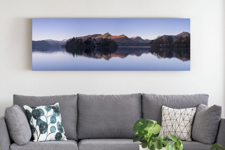
The level of detail in the image should reflect how it will be seen.
In larger rooms, where the print is viewed from a distance, broad forms, clear horizons and strong tonal structure tend to work best. These elements remain legible even when the viewer is several metres away.
In narrower spaces such as hallways or dining areas, closer viewing allows finer detail to become more important. Subtle textures, reflections and smaller compositional elements can add interest at short range.
A wide coastal scene above a sofa may therefore depend on a clear horizon and broad areas of water and sky. A smaller architectural panorama in a hallway can support windows, rooflines, masonry and other details that reveal themselves at closer range.
This is not a question of bold versus minimal imagery. A restrained landscape can hold a large wall effectively, while a darker or more complex image can work in a smaller room if its scale is controlled.
Subject, size and viewing distance should be considered together rather than in isolation.
Use the room’s existing lines
Rooms already contain strong horizontal cues: the top of a sofa, a mantelpiece, kitchen cabinetry or a dining table.
A panoramic print can reinforce these lines, helping the room feel more ordered. Exact alignment is not necessary, but the relationship between furniture and artwork should feel intentional.
The print will usually be narrower than the furniture below it. Leaving visible space at each end prevents the arrangement from appearing crowded and helps establish the furniture and picture as related but separate elements.
Architectural features can also guide placement. Alcoves, long corridors and landing walls often suit the format naturally.
Where a wall is narrow or vertical in emphasis, forcing a panoramic image can feel awkward. In such cases, a portrait format is usually more appropriate.
Colour across a wide frame
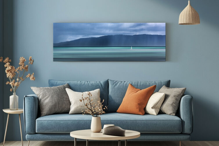
Because panoramic prints occupy a large horizontal area, their dominant colours have a noticeable impact on a room.
It is more useful to assess broad colour zones than small details. A coastal image may be largely cool blue and grey, while woodland scenes often carry continuous green tones. Sunset images can introduce warm colour across much of the frame.
Exact matching to interiors is not essential. In many cases, slight contrast creates better definition.
A practical approach is to relate one or two key colours in the image to fixed elements such as flooring, upholstery, timber or wall finishes. Accessories are less reliable, as cushions, throws and smaller objects tend to change over time.
Consider the visual weight of dark areas as well as colour. A panorama containing deep woodland, heavy cloud or a dark skyline may appear more prominent than a lighter image of the same dimensions.
Monochrome panoramas are effective where a room already contains multiple colours or textures, as they shift emphasis towards form, light and composition.
One wide image or multiple works
A long wall can be filled either with a single panorama or a series of smaller prints.
A grouped arrangement introduces rhythm through repetition and spacing, with each image read individually. It also adds more frames, edges, gaps and focal points.
A panorama presents a single continuous composition. It reduces visual interruption and may be the clearer choice where the room already contains shelving, patterned textiles, books or several decorative objects.
Neither approach belongs exclusively to simple or detailed interiors. The decision depends on what is already present and how much additional visual structure the wall can support.
A useful test is to consider whether the wall needs one sustained focal point or a sequence of smaller moments. A panorama provides the former. A grouped arrangement provides the latter.
Choosing the right image
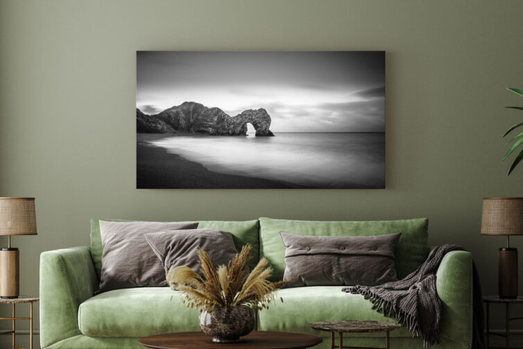
Measurements confirm whether a print will fit, but they do not determine whether it will work visually.
The composition itself matters more. Consider how the eye moves across the image, where visual weight sits, and whether secondary areas remain engaging beyond the main subject.
Look at the image for longer than the initial few seconds. Tate’s guide to slow looking offers a useful principle here: extended attention often reveals relationships and details that are missed during a quick first impression.
For a panorama, look separately at the left, centre and right sections. Each area does not need its own focal point, but none should feel incidental or empty without purpose. Then step back and consider whether the three areas still read as one composition.
Panoramic prints are large enough to become long-term features within a room, so they need to hold attention beyond first impression.
A collection of panoramic photographic prints can help when comparing how landscapes, coastlines, woodland, architecture and more abstract subjects behave within the same extended format.
Selection should not be driven solely by colour matching or the need to fill a difficult gap. Interiors change over time, while a well-composed image remains consistent.
A different way to use wall space
Panoramic prints work because their proportions align naturally with both architecture and wide photographic compositions.
They follow the structure of furniture, make use of horizontal wall space and preserve detail that might be lost in a standard crop. In some rooms, they also provide a quieter alternative to arranging several separate frames.
The format is not universal. It requires sufficient wall width, a photograph composed for the shape and a scale that relates to the surrounding furniture.
The strongest results come from choosing the wall first, then matching the composition, dimensions and presentation to the way the room is arranged and viewed.
When these decisions are made together, a panoramic print does more than occupy a long wall. It allows the full structure of the photograph to be read as intended.